➤➤ Bet on Premier League Soccer at DraftKings ➤➤ Get a bonus up to $250!
A soccer club’s jersey is an integral part of its identity. Those who disrespect a team’s history and heritage when it comes to kit colours are guaranteed to incur the wrath of supporters. Just ask Vincent Tan, the Cardiff City owner who controversially changed the Welsh side’s home strip from blue to red in 2012.
There have been numerous other jersey abominations since the Premier League was launched in 1992. Thankfully, though, England’s top division has also brought us an array of magnificent kits, the best of which can be found below where we have ranked the top 20 best Premier League jerseys of all time.
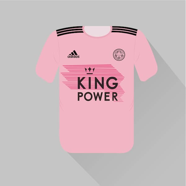
Pink jerseys have been a rarity throughout Premier League history, with Everton’s version in 2010/11 widely seen as a disaster. Leicester got things right nine years later, though, unveiling a lighter tone replete with black flourishes on the shoulders and main body.
This change strip looked particularly good when the sun was out, and it seemed to serve Leicester well too: they were on course for Champions League qualification before the campaign was put on hold.
The player we think of: James Maddison
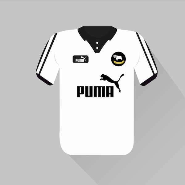
Derby was responsible for the worst season the Premier League has ever seen when they amassed just 11 points in 2007/08. Yet they were Premier League mainstays a decade earlier, and finished in the top half in 1997/98 and 1998/99.
They also looked mighty fine while doing so. Derby got the balance completely right, opting for a predominantly white shirt together with black shorts and socks. Crucially, the Puma logo enhanced the jersey and didn’t disrupt the overall design.
The player we think of: Paulo Wanchope
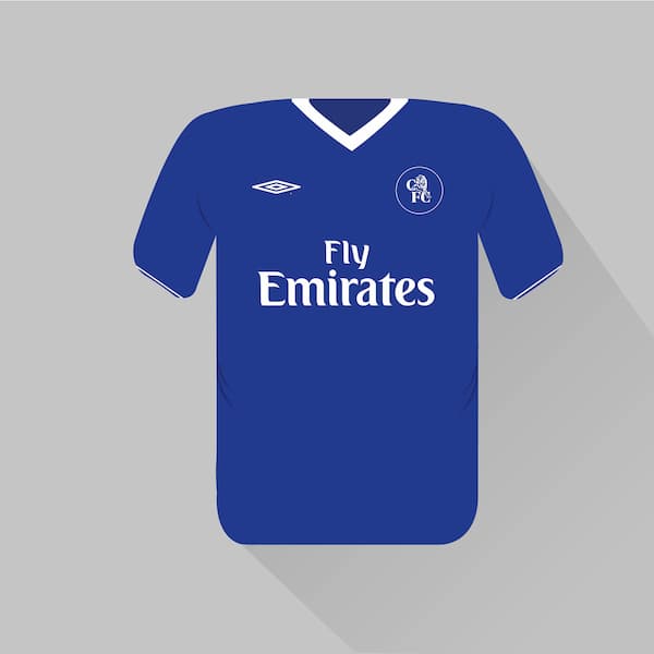
The 2002/03 campaign was a crucial one for Chelsea, which secured Champions League qualification with victory over Liverpool on the final day. Had they failed in their pursuit of a place in Europe’s foremost competition, Roman Abramovich probably wouldn’t have bought the club the following summer.
It’s hard to mess up when your club’s primary colour is blue, but Chelsea went above and beyond with this delightful release. Simplicity was the key here, leading to a clean, sharp design.
The player we think of: Jimmy Floyd Hasselbaink
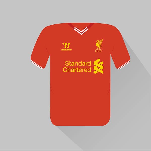
Liverpool fans have bittersweet memories of 2013/14. No one anticipated Brendan Rodgers’ side challenging for the Premier League title that year, so there is a degree of pride in the team exceeding expectations. But the overriding emotion is pain given how close they came to winning their 19th title.
If the league table was determined by jersey quality, Liverpool would have topped it in 2013/14. This was the perfect shade of red – the club has since moved to a darker hue – and the dashes of yellow complemented it wonderfully.
The player we think of: Luis Suarez
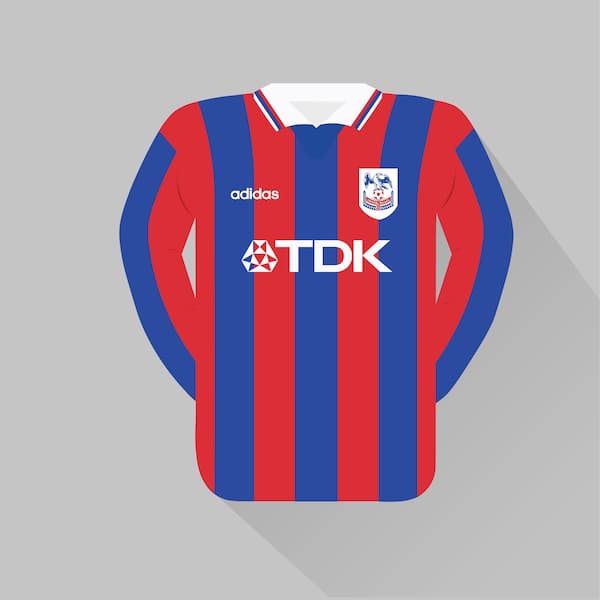
Red and blue are the most common colours in English soccer, but not many clubs combine the two. Crystal Palace is one of the few that does so, having moved away from its then-traditional claret and blue kit in the 1970s.
Palace’s 1997/98 jersey was one of the best they have produced. The London side opted for thinner stripes than they do today, and the white collar and sleeve strips were glorious inclusions.
The player we think of: Attilio Lombardo
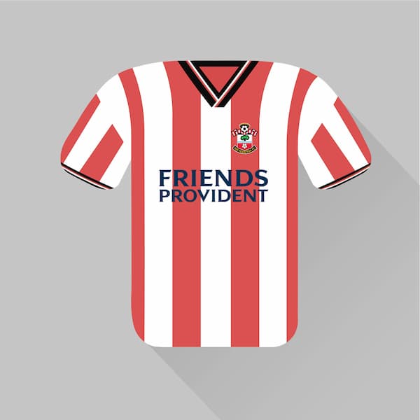
The front of Southampton’s current jersey is divided into thirds – two red, one white – and the back is all-red. That’s a departure from the shirt’s traditional striped design, the best iteration of which came in 2001/02.
This was the legendary Matt Le Tissier’s 16th and final season at the club, but he only played four Premier League games that year. That’s a shame as it restricted his appearances in this marvelous kit, which featured an ideal number of stripes that were delightfully present on the sleeves as well as the body.
The player we think of: James Beattie
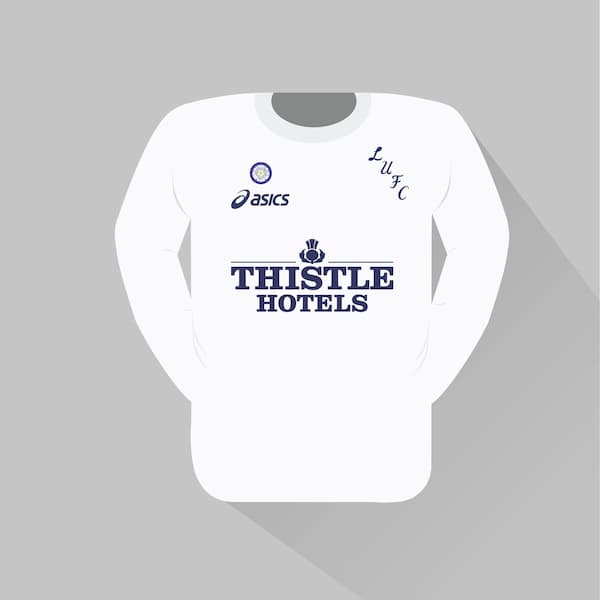
There’s something special about all-white jerseys. Leeds’ players looked eminently classy in their plain but distinctive kits when they were winning trophies aplenty in the 1970s, and the club’s 1995/96 outfit was similarly attractive (alas there would be no silverware to go with it).
Some kit manufacturers go over the top, desperate to put their stamp on a classic number. Asics resisted that temptation in 1995/96, and the result was one of the Premier League’s most stylish kits. The scripted club logo was a fantastic addition too.
The player we think of: Tony Yeboah
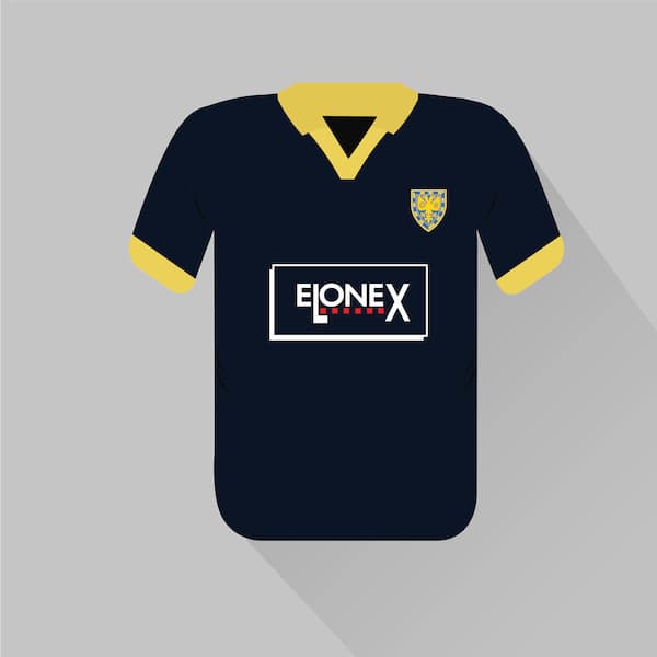
Wimbledon was a Premier League regular in the 1990s, before the club was controversially relocated to Buckinghamshire and renamed Milton Keynes Dons. Its best ever season in the top tier came in 1993/94, but it was the following campaign that Wimbledon released its greatest jersey of the Premier League era.
Dark blue shirts are much rarer than lighter tones, which is surprising when you see how appealing this uniform was. The main colour is beautifully paired with a yellow trim, with the classy collar a particular highlight.
The player we think of: Vinnie Jones
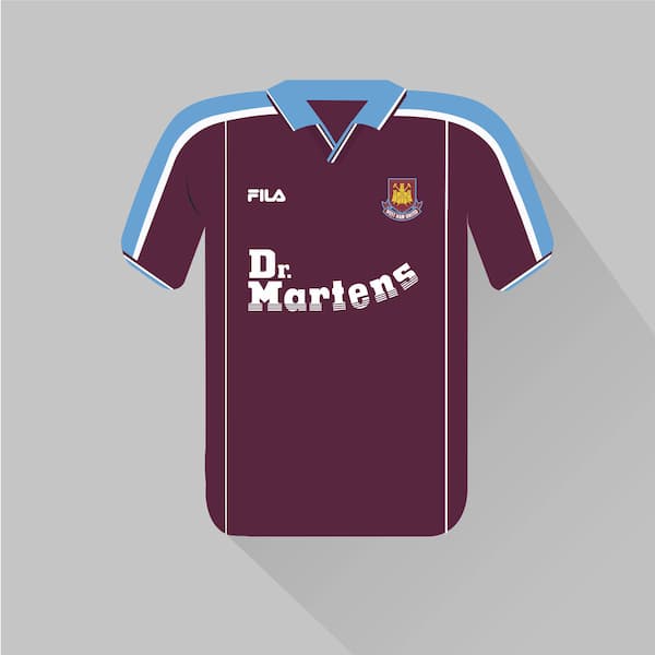
Claret and blue are classic, historical colours in English soccer, with West Ham and Aston Villa the two most well-known wearers. The former produced this masterpiece at the turn of the millennium, ensuring that they saw in the year 2000 in style.
The Dr Martens sponsor logo is terrific, but it’s the blue sleeves and collar that really make this jersey. The 1999/00 season was Paolo Di Canio’s first at West Ham, and it was in this shirt that he scored his famous scissor-kick goal against Wimbledon – one of the best strikes in Premier League history.
The player we think of: Paolo Di Canio
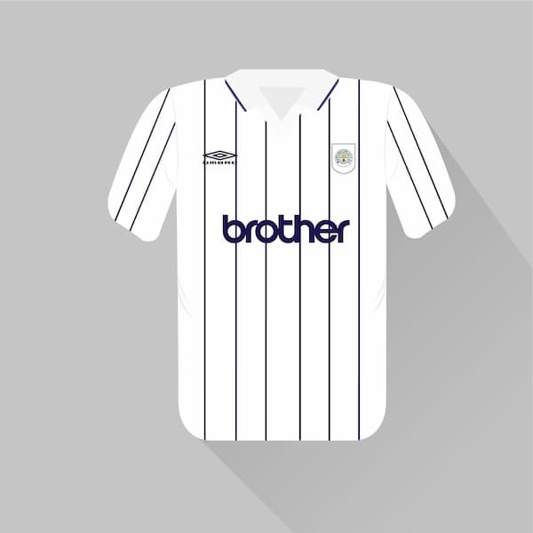
Most Premier League clubs produce third kits which can be used if there’s a clash between both their home and away jerseys and their opponents’ strip. That only happens occasionally, meaning we didn’t get to see as much of Manchester City’s 1994/95 offering as we would have liked.
Blue pinstripes on a white background isn’t a design you see too often, but City mastered it here. Elsewhere, the sky blue trim at the bottom of the shorts was a small but charming addition.
The player we think of: Nicky Summerbee
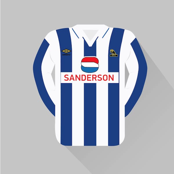
Soccer jerseys were much baggier in the 1990s, and this Sheffield Wednesday outfit was all the better for it. The Sanderson sponsor’s logo works brilliantly against the blue and white stripes, adding a third colour to the kit without being overly intrusive.
The decision to make Umbro’s logo and the club crest black and yellow was another masterstroke. Wednesday lost both the League Cup and FA Cup finals this season, but at least they had such a beautiful shirt to wipe their tears on.
The player we think of: Chris Waddle
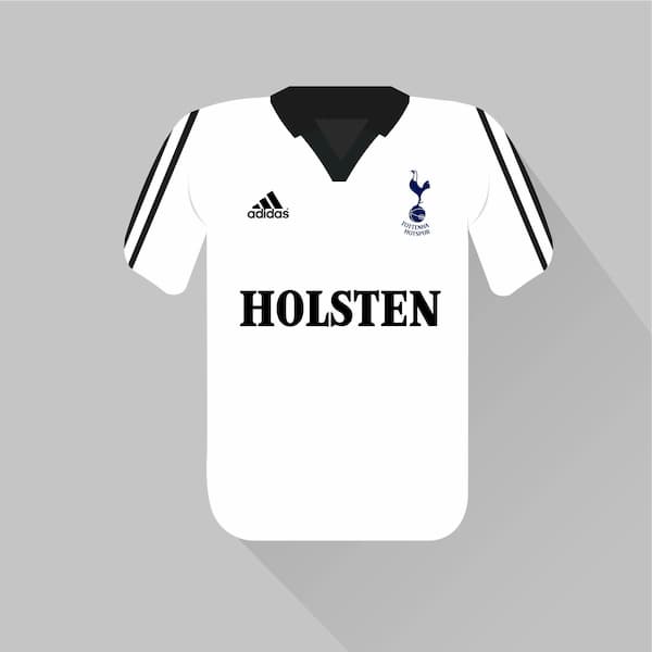
Tottenham is now firmly established among the Premier League’s big six, but it wasn’t always thus: Spurs finished in the top nine just three times in the 1990s.
The 1999/00 brought a 10th-place finish that was both underwhelming and par for the course. Still, Tottenham’s jersey that year was tremendous, featuring a clean main body, a congruous sponsor’s logo and a retro collar.
The player we think of: David Ginola
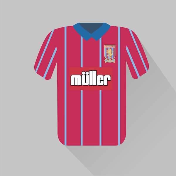
Aston Villa’s customary home kit features a claret body and blue sleeves, so it was a risk to depart from the tried and tested formula in 1993/94. As we’re sure you’ll agree, the gamble paid off.
This is a gorgeous jersey, with blue pinstripes running down a claret base. The button-up collar is smart and the club crest is elegant, making this Villa’s best kit of the Premier League era.
The player we think of: Dean Saunders
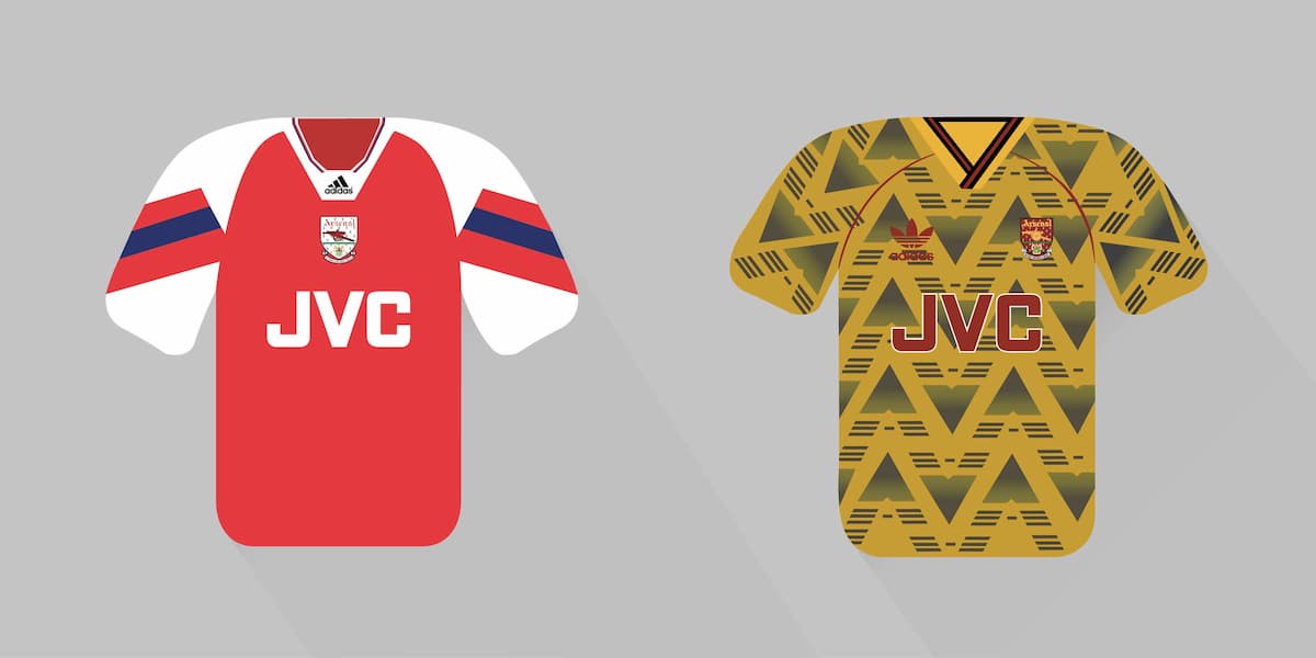
We just couldn’t separate Arsenal’s two offerings from the Premier League’s inaugural season. The home jersey is a classic, with the centralised badge and sponsor’s logo lending it an air of sophistication.
The away kit was a daring design that could have gone wrong, but there’s something special about that combination of yellow, black, and red – and, vitally, the unique pattern on the front isn’t an eyesore in the way that Norwich’s home shirt was that same season.
The player we think of: Ian Wright
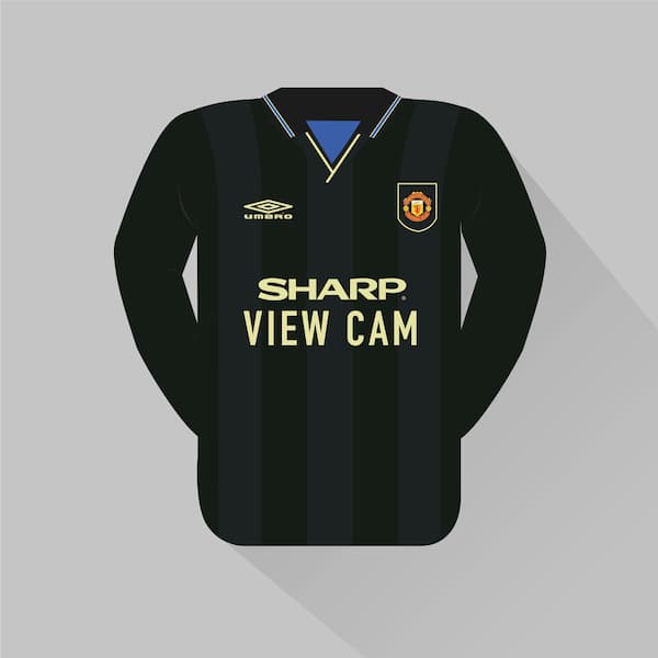
Manchester United has experimented with numerous colours for their change strip in the Premier League era, including white, blue, grey and a garish green and yellow. The best they hit upon was the black kit used in 1993/94.
The tinges of yellow – not just on the shirt but the shorts and socks too – are absolutely vital in making this jersey work. United didn’t lose a single away game in the Premier League while wearing this uniform in 1993/94.
The player we think of: Eric Cantona
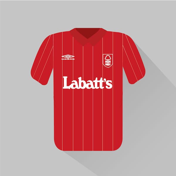
Forest was relegated in the Premier League’s debut season, which was also Brian Clough’s last season in charge at the City Ground.
The iconic manager, who won two European Cups earlier in his Forest tenure, was kitted out in his famous green jumper that campaign, but his players looked even better out on the pitch. The pinstripes on this home kit are subtle and stylish, and we love the consistency of the two logos and club crest all being white.
The player we think of: Roy Keane
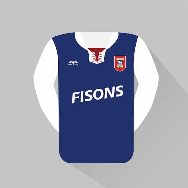
Lace-up collars were more common in the 1890s than the 1990s, but Ipswich demonstrated that there was still a place for them in the Premier League’s maiden campaign.
This jersey was a perfect example of providing a nod to a club’s heritage without going too far so as to produce an outdated, old-fashioned uniform. The splashes of red break up the dominant blue, and the slight tilt of the sponsor’s logo is an excellent piece of ingenuity.
The player we think of: Chris Kiwomya
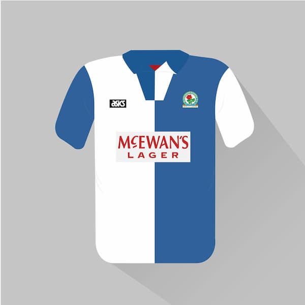
Blackburn players would have happily worn diapers if it guaranteed them the Premier League title in 1994/95. It’s a neat bonus, then, that they were dressed so immaculately when winning the championship for the first time since 1914.
Blackburn’s blue and white halves were at their sharpest this season, replete with a handsome collar and animating dashes of red.
The player we think of: Alan Shearer
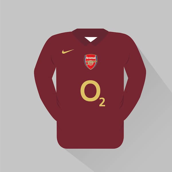
Arsenal’s traditional home colours are red and white, but in 2005/06 the club launched a “redcurrant” outfit to commemorate its final season at Highbury. This kit was similar to that which was donned by Arsenal players back in 1913, their first year at the stadium.
It went down a treat. The gold Nike swoosh and O2 logo looked stunning up against the maroon body, and the centralisation of the club crest increased the throwback vibes.
The player we think of: Thierry Henry
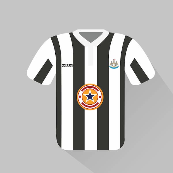
Simply the greatest kit in Premier League history. Newcastle may have fallen short in its quest to win the Premier League title in 1995/96, but its jersey from that season is better than anything any other club has produced.
The black and white stripes are the perfect width, neither too thick nor too thin. The collar is an exquisite touch, and the sponsor’s logo and name – containing the team’s own moniker, for crying out loud – are exceptional. This Newcastle jersey is a worthy winner.
The player we think of: Les Ferdinand
That concludes our countdown of the top 20 best jerseys of the Premier League era, but jerseys are a very personal thing. Nostalgia and personal allegiances play a big part and we have no doubt missed some of your personal favorite Premier League kits.
Leave a comment below and tell us if you agree or disagree with our rankings.
/fit-in/400x235/1665739173/top-4-predictions.jpg.jpeg)
Premier League Top Four Odds, Predictions, Picks 2025
2 days ago | Greg Lea/fit-in/400x235/1665739170/top-scorer-pl.jpg.jpeg)
Premier League Top Scorer Predictions, Odds, Picks 2025
2 days ago | Greg Lea/fit-in/400x235/1665738444/relegation-premier-league.jpg.jpeg)
Premier League Relegation Odds, Predictions, Picks 2025
2 days ago | Greg Lea
We support responsible gambling. Gambling can be addictive, please play responsibly. If you need help, call
1-800-Gambler.
WSN.com is managed by Gentoo Media. Unless declared otherwise, all of the visible content on this site, such
as texts and images, including the brand name and logo, belongs to Innovation Labs Limited (a Gentoo Media
company) - Company Registration Number C44130, VAT ID: MT18874732, @GIG Beach Triq id-Dragunara, St.
Julians, STJ3148, Malta.
Advertising Disclosure: WSN.com contains links to partner websites. When a visitor to our website clicks on
one of these links and makes a purchase at a partner site, World Sports Network is paid a commission.
Copyright © 2025
/filters:no_upscale()/fit-in/320x585/1665755162/best-premier-league-jerseys.jpg.jpeg)